Image of five mobile mockups combined. The center mockup with a logo and language options, and next, mockup with cards illustration as “agree” and disagree. There are also glimpses of an opinion screen about a sports event, and a screen with multiple themes.

toggler

Responsive web design for community social good​ ☻

Create a tool that Japanese schools and parents can use to better communicate about their children.

Role

UX design from conception to high-fidelity prototype, Writing, Illustration

Tools

Figma, Adobe Illustrator

Duration

December 2022 to January 2023

Who creates the educational environment?

Background

Local communication will impact student life (which comes only once!)

Old-fashioned, totalitarian school rules have been in place for decades. Need to consider whether the restrictions on events and daily life for children are appropriate.

The hard work environment for teachers and parents.

A need for tools to reduce the burden of meetings and other time-consuming decisions.

Dedicated mobile app and web versions

Mockups of responsive web design, desktop, laptop, and mobile versions.

Interactive Communication

On the parents' side:
A dedicated mobile app

An image of a mobile app. The screen has an opinion card about a sports event. The text is “I would like to see the athletic festival held on the same scale as it was before the pandemic, with safety measures in place.” Under the text, there are two buttons “agree and disagree”

Parents create voting cards and vote anonymously on each card.

On the teachers' side:
Web app

An image of a Tablet. The screen shows multiple themes. Below the search bar, a list of themes to be discussed, such as athletic events, school lunches, and classroom rules.

In response to the majority opinions, teachers will provide feedback to parents on future actions after discussing those in the teacher’s version of the tool.

*System ideas are based on the rough consensus board of the Taiwanese government. Arranged for the use of Japanese people.

Challenge

Half of the interviewees in the primary study showed some sort of rejection of the initial idea.
<Factors>

  • Fear of increased communication with others
  • The term “rough consensus” sounds too abstract in Japanese

Ideation Process

Understanding the Users

Primary Research

Pain Point Findings

Value Proposition

Primary Research

Research Goal

What are the solutions and the bottlenecks with respect to addressing the current problems in education? Explore the context.

Participants

Four working mothers who have school-age children, and two teachers.

Residents

Kanto, Kyusyu, and Shikoku areas in Japan

Age

30–65

Method

Moderated and unmoderated interviews

Pain Point findings

Lack of time

The working environment of both teachers and parents is extraordinarily busy.

No interactive communication

Although they participate in surveys from schools, parents do not know how the school uses the results.

Pressure to do nothing

The claustrophobic rural atmosphere makes parents to keep their names out of the spotlight.

The powers that are in our area have a lot of say, so I cannot say anything.
A working mother
The education field is conservative and always has its hands full. Several schools might not even have a conversation to introduce this app.
A teacher
I try to write what I want to say in questionnaires about school issues that include my name, but I have never felt that it means anything.
A working mother

Is it feasible to create an application that would address the concerns that the interviewees mentioned?​

Design Process

Design & Refine

User Flow & Paper Wire Frames

Low-Fi Prototype

 Usability Test

High-Fi Prototype

 Usability Test

Persona

The personas – so as not to lose sight of the criteria of “who we are creating this for.”  

Whenever the team is unsure about a feature or design decision, they can return to this point.

Mami

Age: 38, Hometown: Kanagawa, Japan

A working mother who has two public school-aged children. 

Toru

Age: 43, Hometown: Fukuoka, Japan

A 6th-grade homeroom teacher in a public school in Fukuoka.

Connect small-voice majority and conservative schools  

High-fidelity prototype

An animation of the prototype for the mobile app version. It shows from the introduction screens and registration, and to click the theme buttons from the home screen.

Parents' version

An animation of the prototype for the mobile app version of the main flow. After clicking the theme, vote to a displayed opinion card by agree or disagree, and the screen automatically proceeds to the next opinion. Get results of how many participants agree with each opinion. Put alternative opinions to the theme when the participant needs them.

Mainly use the dedicated mobile app. Each opinion card is shown in a game-like manner to encourage participation. Participation is anonymous.

Teachers' version

An animation of the prototype for the tablet version. Start choosing the theme to discuss and vote to opinions from the parents. Put alternative opinions to the theme when the participant needs them.

Mainly use the web version. Multiple pieces of information are shown on one screen to process tasks in a shorter time. Participation uses their name.

Usability study with the low-fi prototype of the dedicated mobile app

Participants

Five working women and men who have school children

Residents

Kanto and Shikoku areas in Japan

Age

30–45

Method

Moderated and unmoderated interviews

Findings of the usability study

Before

2/5 people were confused by the registration screen being displayed at the first action after clicking the home screen.

After

Display the registration screen at the end of the description screens.

Before

A mobile app image with a screen of the low-fidelity mockup. The title of the page is “about the sports event 2023”. Below the title, two buttons are “complete

2/5 people stopped contributing because they did not know what the CTA button instructions “Add alternative ideas to the theme” were referring to.

After

A mobile app image with a screen of the high-fidelity mockup. The title of the page is “about the sports event 2023”. Below the title a description and two buttons are. The description is You can add your opinion to this theme as a new opinion card. The button text is “Write your opinion” and “Complete without submitting an opinion”

Re-examine the name of the CTA button.
Add more guidance to the page.
Change the CTA button text from “Add your opinion to the cards” to “Write your opinion.”

Before

A mobile app image with screens of the low-fidelity mockup. The home screen immediately changes to the registration screen.

3/5 were distracted by the text links before seeing “Position of your answers.”

After

Redesign to reduce the actions at the result screen.

Prevent blow-up

The participants can post only alternative suggestions without direct reps for opinions.

Impact

I believe we have created a base in terms of scooping up voices from the majority of small voices.


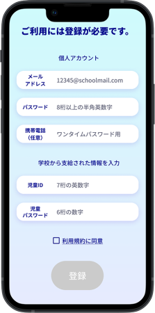
Much more interesting than I expected. When I first heard about it, I imagined it would be complicated.
A working mother
I think it is easy to use. I will bring up the subject myself as I always have opinions.
A working father

What I learned

I excluded students from the pool of users after the earlier research against my initial plan. Both teachers’ and parents’ rejection of children-involvement in digital chats was so strong that it seemed impractical to introduce it on a per-school basis.


Although the system can be for business or politics, choosing the educational site as the first user context creates the experience of how we can change the community around us with our actions, and it becomes hopeful for children. Those who rejected the “communication board” agreed with me when I described this basic thought.


Some communities are beginning to adjust school rules to reflect community input. I felt that this tool can meet the demands of the times.

Further steps

A larger-scale test

The need for personal anonymity varies with respect to regional status.
It is necessary to know what measures will be effective through conducting a more practical and larger study.

Monetize

Present ideas for funding sources to provide a sustainable service.

Reiko Yoshida Bilingual visual designer in Tokyo | Freelance | Branding | UX UI | Graphic design | Localization | Available in Japanese and English