PetStats

Role

UX design from conception to high-fidelity prototype, Writing, Illustration

Tools

Figma, Adobe Illustrator

Duration

March to August 2022

Create an application that allows users to manage their pet's health easily.

Final Features

Nutritional
Tracker

By simply registering the food the pet is currently on and inputting the amount eaten, the pet owner can check if the nutritional value is sufficient.

Advice from
Community

Get tips from articles written by vets and pet owners on how to maintain a healthy pet.

Reliable
Online Store

The online store offers vet-recommended food.

Ideation Process

Understanding the Users

Primary Research

Pain Point Findings

Value Proposition

Primary Research

Research Goal

“Nutritional tracker for pet food” 

In order to establish if there is a demand for this idea in Asia, the primary research found the common issues that pet owners face regarding their choice of pet food.

Participants

Seven people who have had a pet for over five years

Residents

Japan, Thailand, the Philippines

Age

30-65

Method

Moderated and unmoderated interviews

Pain Point findings

Quality of information

Often pet owners find it difficult to find information that fit their pets’ health status.

Gap of availability

There is a scarcity of reliable pet food in some areas.

Budget

Some pet owners need to keep their pets healthy through daily care without relying on frequent visits to the vet.

We've overcome unsuitable food and ill health to get to where we are now. (Caring is also love, but I would have avoided it if I could have.)
A cat owner
Thailand
Veterinary care is expensive. It's hard to take my dog regularly just for tests.
A dog owner
Japan
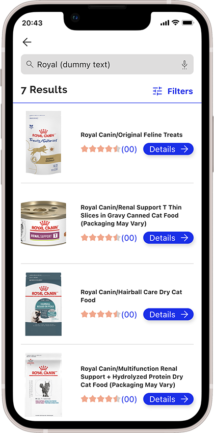
There are veterinary pet supply stores in my neighborhood, but the brand I want is usually out of stock.
A cat owner
The Philippines

Value Proposition

Next step is to determine the product features. The selection is based on whether it is user-oriented or not.

Conducted a competitive audit on other companies to figure out if the features are something users would be happy to obtain.

Persona

The personas – so as not to lose sight of the criteria of “who we are creating this for.”  

Whenever the team is unsure about a feature or design decision, they can return to this point.

Katherine

Age: 32, Hometown: City of Manila, The Philippines

A photographer keeping two cats that have a possibility of recurrence of kidney disease. They need reliable information about cat food without the cost to go to the vet because they can not control the cat’s diet properly although they feel the owner’s responsibility.

Masao

Age: 61, Hometown: Tokyo, Japan

A senior sales manager keeping an aged dog that loses appetite. They need an easy way to choose adequate dog food for his dog because they are not technology savvy, and can’t gather information online by himself

Design Process

Design & Refine

User Flow & Paper Wire Frames

Low-Fi Prototype

 Usability Test

High-Fi Prototype

 Usability Test

Paper wire frame to Low-Fi Prototype

Went from hand-drawn to digital wire frames, then they prototyped the main user flow.

Identified from user feedback if there were any major structural problems in the early stages.

High-Fi Prototype

Play Video

Followed the Web Content Accessibility Guidelines (WCAG) 2.0 standards.

Usability Study

1. Using the Low-fi prototype

2. Using the High-fi prototype

Participants

Four people who have had a pet for over five years

Residents

Japan, Thailand, the Philippines

Age

30-65

Method

Unmoderated  usability test using the prototypes

Usability Study Findings from the Low-Fi Prototype

The buttons with text can be accessible to all users.

The app should explain clearly that the chart generates the ideal nutrition status from the registered information.

Some users need a different name for the navigation button.

Usability Study Findings from the High-Fi Prototype

Some users are unfamiiliar with radar charts and need a bar graph option on the tracker.

Refine

Button Descriptions and Less Page Density

Before

After

Text descriptions were added to buttons as oversimplified icons did not work for some users.

During the High-Fi prototyping phase, we distributed the tasks onto separate pages in order to simplify them.

Communication for the Concept

Before

After

Before: Jumped to the home page directly after registration

After: Inserted transition page

I inserted animations highlighting the benefits for users and also made introductions to impress the concept.

Refine the Navigation Bar

Before

After

Users said it was hard to find the “vet articles” function, even though they found them appealing. We improved the notation on the navigation bar and also made the article titles more attractive on the home page.

Impact

The users loved the idea, and I received a lot of positive feedback. “If this was an app, I’d like to use it!” – A quote from a user.
Now, I can believe in the potential to solve real-world problems through this idea.

What I learned

Although this process involved getting used to using Figma, this was a practical study to compress assumptions and biases and make decisions following direct user feedback.
I could reconfirm and reinforce that putting more effort into the framework would facilitate collaboration.

Reiko Yoshida Bilingual visual designer in Tokyo | Freelance | Branding | UX UI | Graphic design | Localization | Available in Japanese and English